Car Digital Cockpit.
Jan 25.
I created Car Digital Cockpit, an advanced automotive interface that enhances the driving experience with interactive design, real-time analytics, and seamless connectivity.
How I Reimagined the Car Dashboard Experience with Seamless Digital Cockpits.
Developed intuitive digital cockpits integrating real-time data visualization, driver-centric design, and responsive interfaces.
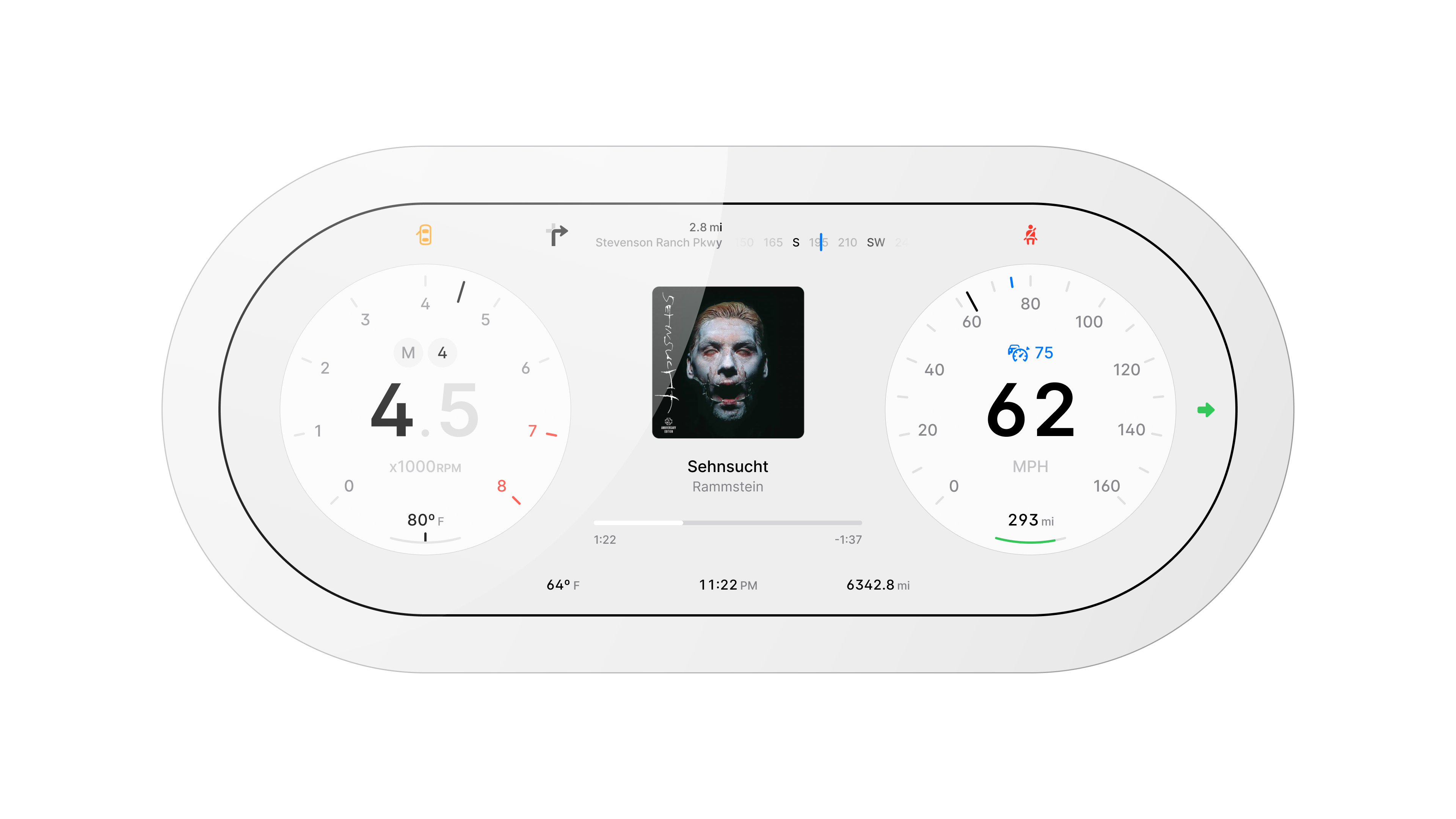
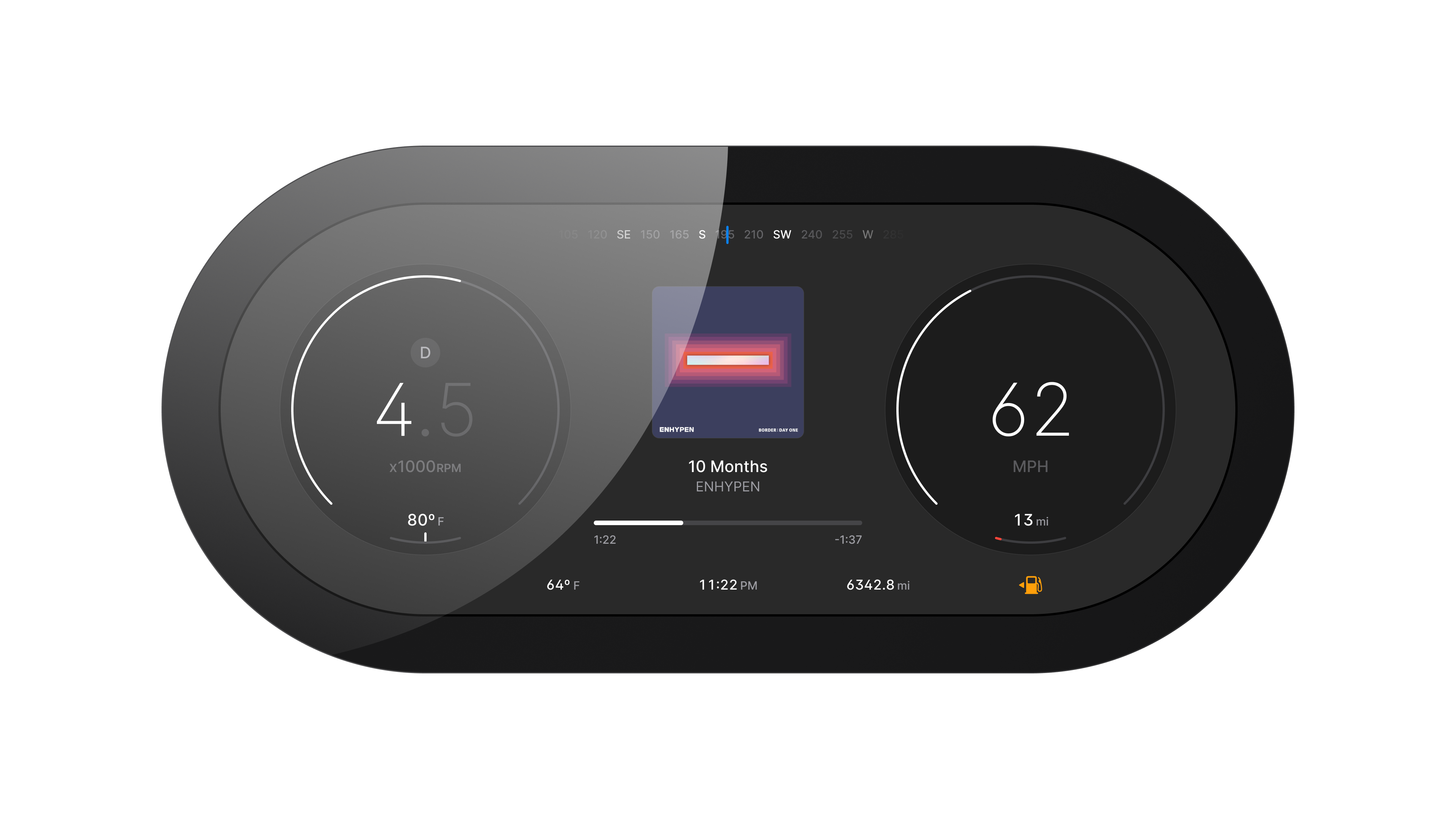
Full dashboard layout
Beginning.
This started in a parked car while I stared at the cluster and wondered why it tells me so little about the drive I am actually having. I asked what it would feel like if the interface responded to context rather than just listing dials.
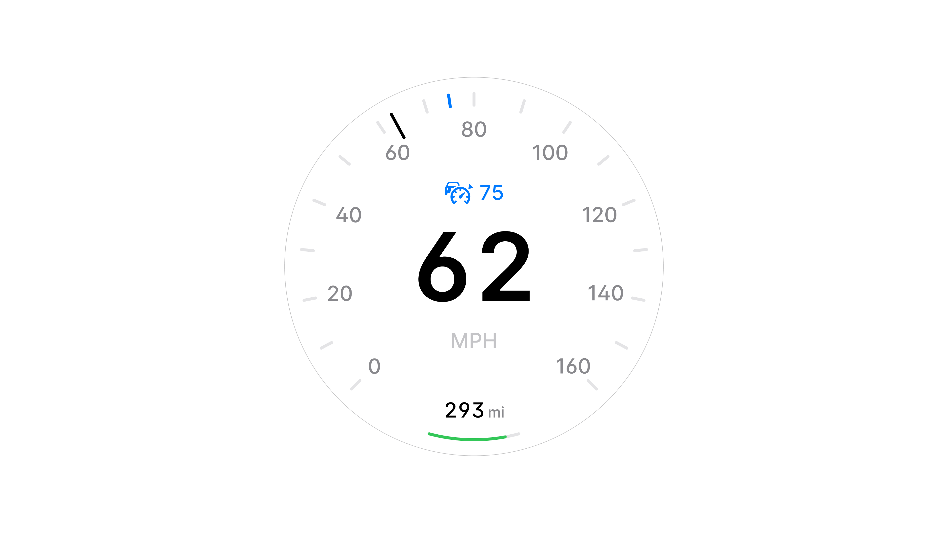
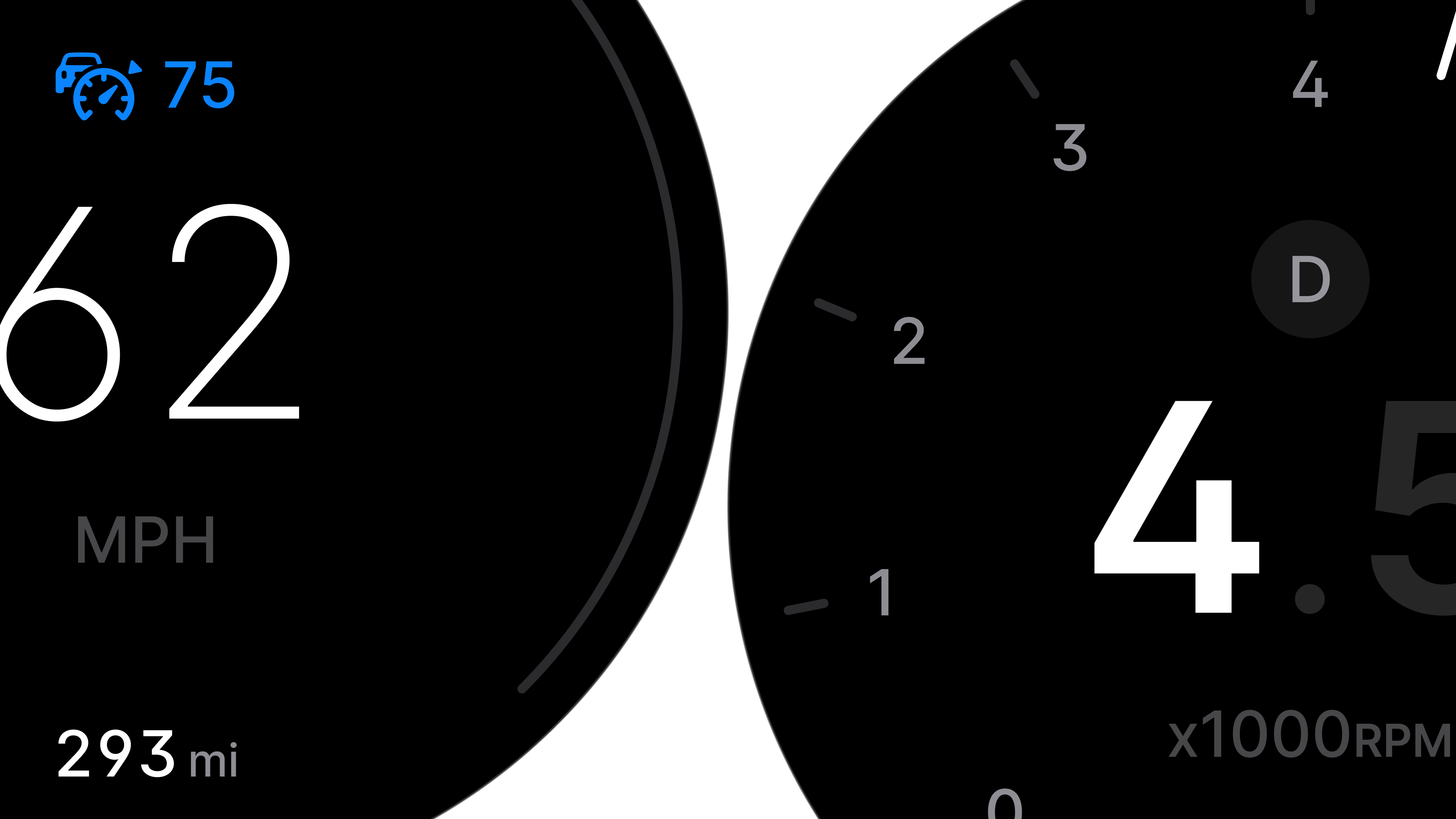
Speedometer module
Goal.
Design a cockpit that behaves more like good software. Glanceable, contextual, and calm. Bring speed, RPM, range, navigation, music, and weather into one conversation without clutter.
Problem.
Most dashboards report numbers but rarely help you understand what matters in the moment. You glance, stitch things together in your head, and return to the road. It felt like wasted attention.
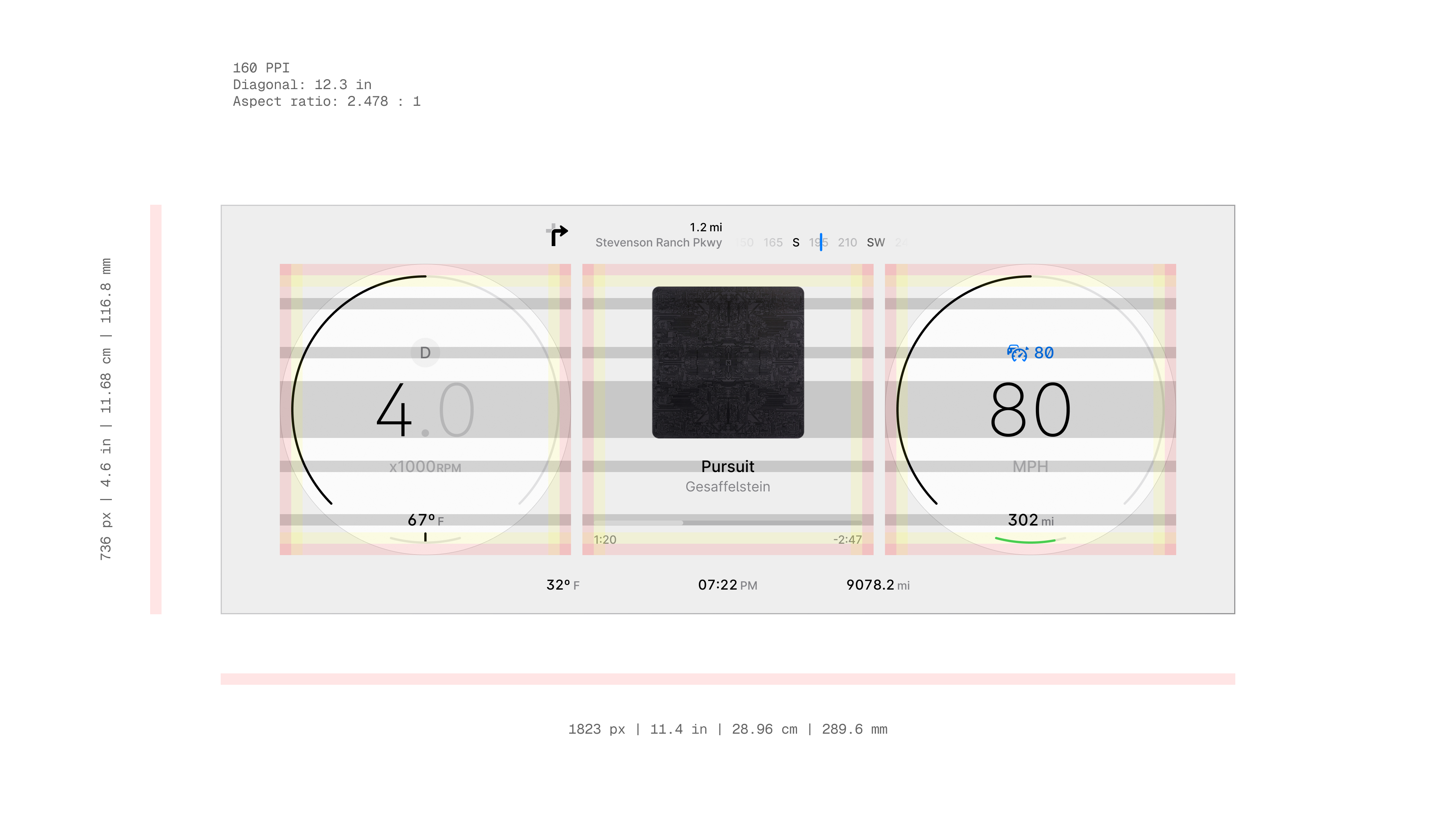
Screen dimensions and parameters
Primary Insight.
Drivers do not need more data. They need a story that ties data together. Once I framed the system around mechanical, environmental, and emotional cues, the layout choices became clearer.
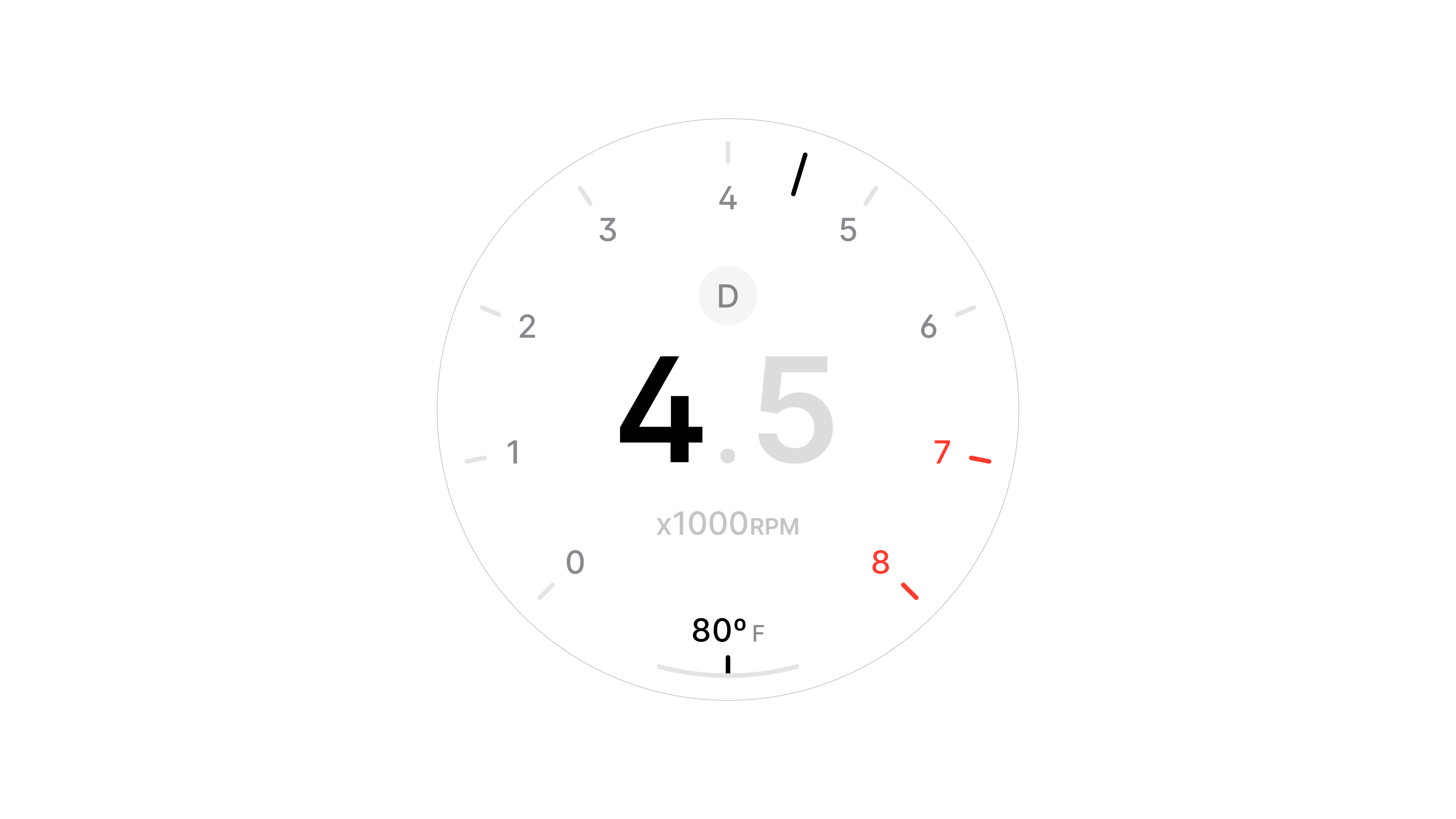
RPM and transmission module
Research and Observation.
I collected photos and videos from different vehicles and studied what stayed consistent, what vanished, and how information was prioritized.
Many clusters treated each metric in isolation. That gap shaped the concept of a unified center that binds the sides.
Alternate dashboard layout
Circular Design.
I leaned into a circular model. The left side carried RPM and transmission. The right side focused on speed and range. The center became the place where the drive comes together with music, navigation, and weather.
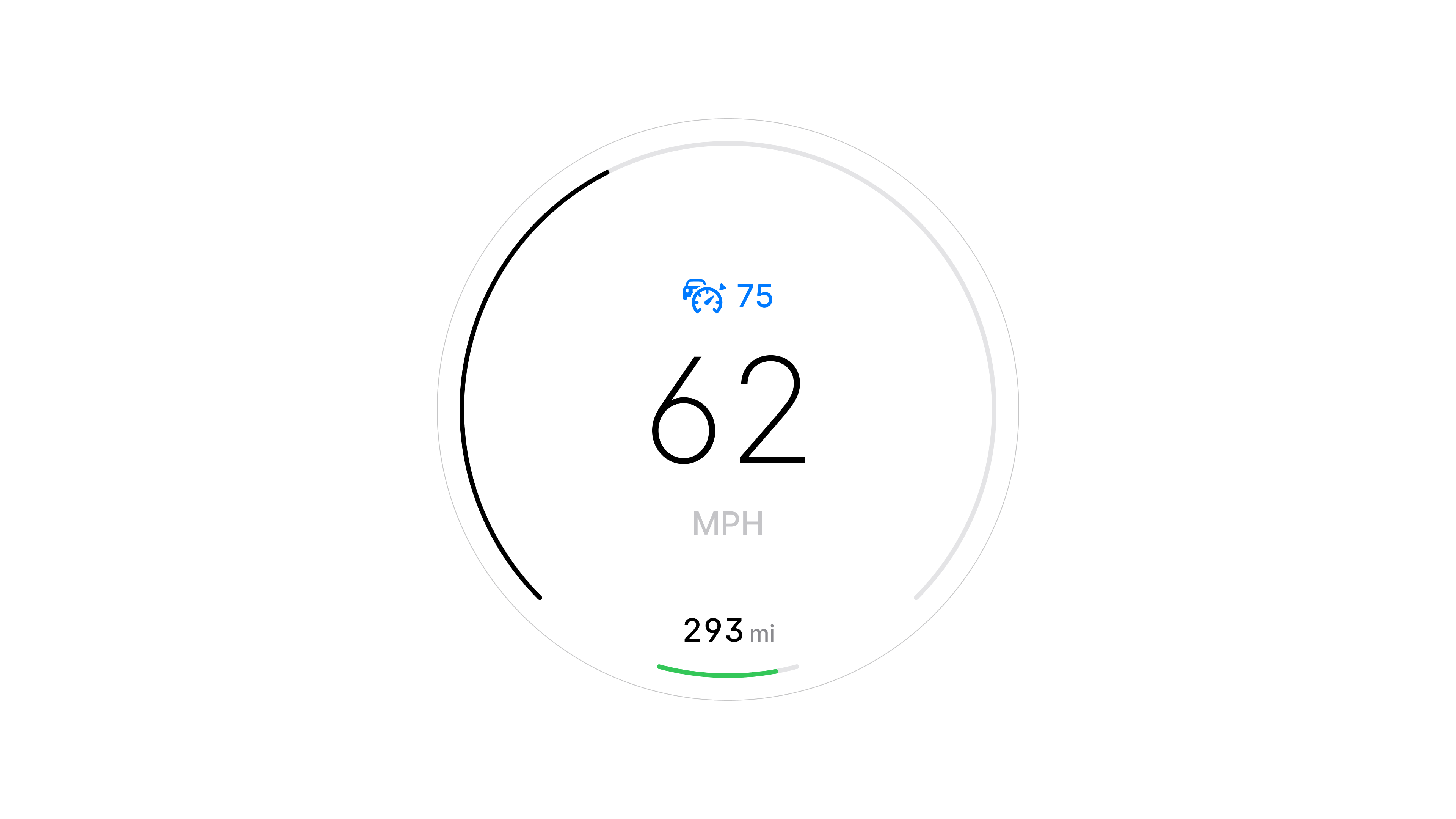
Minimal speed view
Design and Interaction.
Everything had to read at a glance and work across multiple driving contexts. I prioritized spacing and hierarchy so elements feel related but never crowded.
Utility won every tradeoff. For example, keeping time and odometer visible at all times anchored the system and removed vagueness.
Key Screens.
Circular cluster with left RPM and mode, right speed and range, and a center panel that adapts to media and navigation. Variations for day and night, and contextual states for long drives, city traffic, and quick trips.
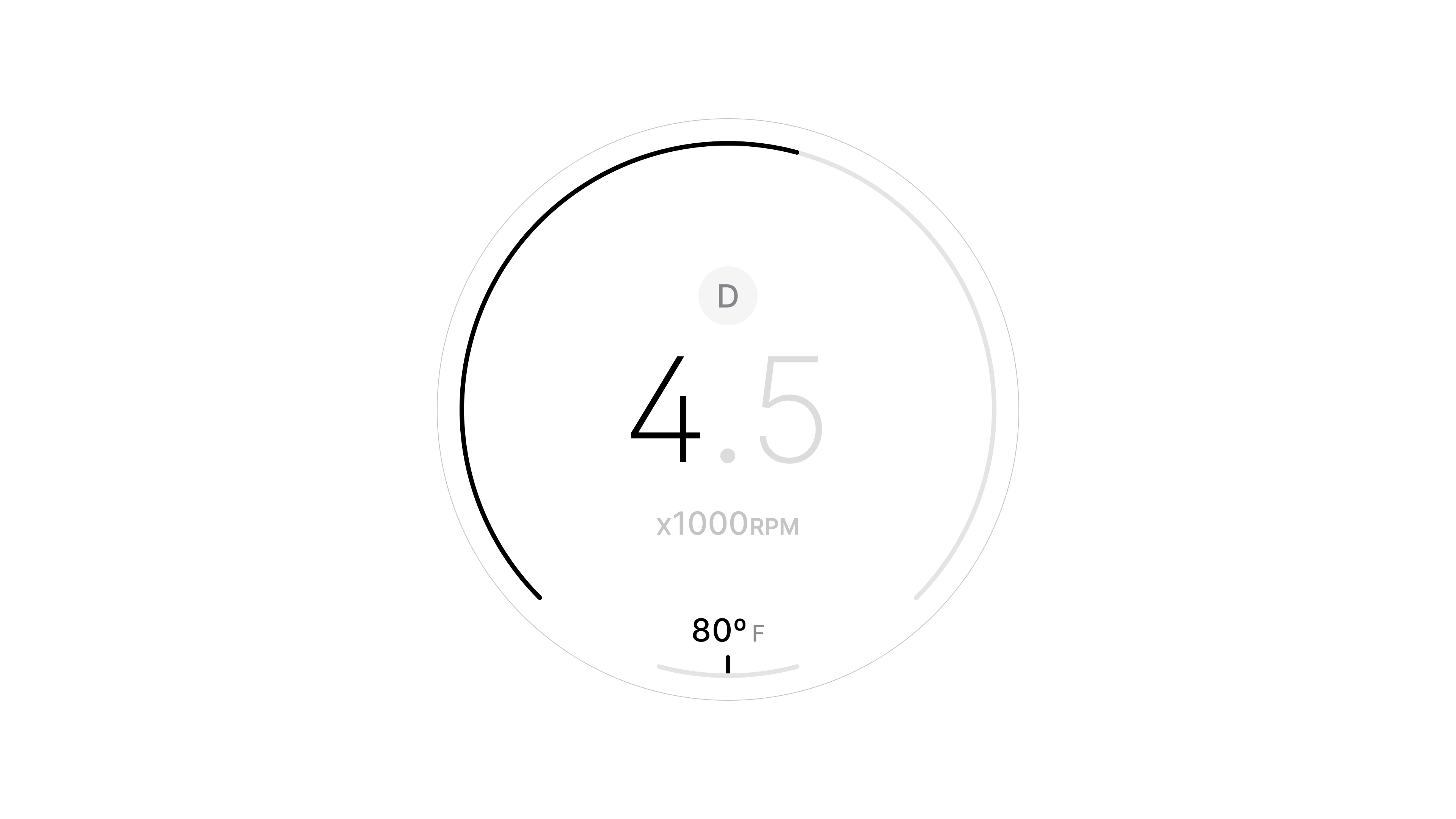
Minimal RPM view
Visual and Motion.
The visuals follow neutrality. Soft whites and shadows add depth without noise. Type is restrained and icons are learnable at a glance.
If I push this further I will invest more in motion since a cockpit is never still and transitions carry meaning for state changes.
More
What I Learned.
Detail is not how much you add but how much you learn to leave out. The cockpit felt better when I removed cleverness and restored anchors like time and odometer.
Next I would prototype richer motion to test how the system communicates change without speaking.
Takeaway.
Car Digital Cockpit is an attempt to make an instrument panel feel like a calm companion. Fewer questions, faster understanding, and a drive that feels connected rather than busy.
More in Projects.
Car Control Widgets.
Oct 24.
Crafted native-style widgets for car controls, bringing Apple’s clarity and consistency into everyday driving.
Noque.
Mar 24.
Engineered an innovative mobile app simplifying restaurant interactions through streamlined ordering and efficient pickup.
Musyka.
Nov 24.
Designed a vibrant digital music experience tailored specifically to the dynamic preferences of new generation.
Kodomi.
Dec 24.
Built a versatile no-code tool empowering designers to rapidly prototype and share UI components and full websites.
Mesoki.
Nov 23.
Established a minimalist stationery brand that seamlessly blends functional design and engaging digital storytelling.
More in Nuggets.
FUI.
Dec 25.
An exploration of interface aesthetics where clarity, composition, and signal hierarchy take priority over practical constraints.
Component Shortcut.
Sep 25.
Added a custom shortcut feature for design components to reduce friction and avoid digging through the library every time.
More in Readings.
Word Choice Is Design.
Mar 26.
A reflection on how Apple Maps uses voice intonation to manage your emotional state while driving, and why Google Maps and Waze don't.
Pebble 2 Duo.
Nov 25.
A reflection on finally owning the Pebble 2 Duo, a tiny comeback story about detail, nostalgia, and honest design.
Hello, World!
Sep 25.
A short manifesto for what Readings is, how I use it, and how to read it.
Copyright Maksim Anisimov.
Car Digital Cockpit.
Jan 25.
I created Car Digital Cockpit, an advanced automotive interface that enhances the driving experience with interactive design, real-time analytics, and seamless connectivity.
How I Reimagined the Car Dashboard Experience with Seamless Digital Cockpits.
Developed intuitive digital cockpits integrating real-time data visualization, driver-centric design, and responsive interfaces.
Full dashboard layout
Beginning.
This started in a parked car while I stared at the cluster and wondered why it tells me so little about the drive I am actually having. I asked what it would feel like if the interface responded to context rather than just listing dials.
Speedometer module
Goal.
Design a cockpit that behaves more like good software. Glanceable, contextual, and calm. Bring speed, RPM, range, navigation, music, and weather into one conversation without clutter.
Problem.
Most dashboards report numbers but rarely help you understand what matters in the moment. You glance, stitch things together in your head, and return to the road. It felt like wasted attention.
Screen dimensions and parameters
Primary Insight.
Drivers do not need more data. They need a story that ties data together. Once I framed the system around mechanical, environmental, and emotional cues, the layout choices became clearer.
RPM and transmission module
Research and Observation.
I collected photos and videos from different vehicles and studied what stayed consistent, what vanished, and how information was prioritized.
Many clusters treated each metric in isolation. That gap shaped the concept of a unified center that binds the sides.
Alternate dashboard layout
Exploration and Concept.
I leaned into a circular model. The left side carried RPM and transmission. The right side focused on speed and range. The center became the place where the drive comes together with music, navigation, and weather.
Minimal speed view
Design and Interaction.
Everything had to read at a glance and work across multiple driving contexts. I prioritized spacing and hierarchy so elements feel related but never crowded.
Utility won every tradeoff. For example, keeping time and odometer visible at all times anchored the system and removed vagueness.
Key Screens.
Circular cluster with left RPM and mode, right speed and range, and a center panel that adapts to media and navigation. Variations for day and night, and contextual states for long drives, city traffic, and quick trips.
Minimal RPM view
Visual and Motion.
The visuals follow neutrality. Soft whites and shadows add depth without noise. Type is restrained and icons are learnable at a glance.
If I push this further I will invest more in motion since a cockpit is never still and transitions carry meaning for state changes.
More
What I Learned.
Detail is not how much you add but how much you learn to leave out. The cockpit felt better when I removed cleverness and restored anchors like time and odometer.
Next I would prototype richer motion to test how the system communicates change without speaking.
Takeaway.
Car Digital Cockpit is an attempt to make an instrument panel feel like a calm companion. Fewer questions, faster understanding, and a drive that feels connected rather than busy.
More in Projects.
Car Control Widgets.
Oct 24.
Crafted native-style widgets for car controls, bringing Apple’s clarity and consistency into everyday driving.
Noque.
Mar 24.
Engineered an innovative mobile app simplifying restaurant interactions through streamlined ordering and efficient pickup.
Musyka.
Nov 24.
Designed a vibrant digital music experience tailored specifically to the dynamic preferences of new generation.
Kodomi.
Dec 24.
Built a versatile no-code tool empowering designers to rapidly prototype and share UI components and full websites.
Mesoki.
Nov 23.
Established a minimalist stationery brand that seamlessly blends functional design and engaging digital storytelling.
More in Nuggets.
FUI.
Dec 25.
An exploration of interface aesthetics where clarity, composition, and signal hierarchy take priority over practical constraints.
Component Shortcut.
Sep 25.
Added a custom shortcut feature for design components to reduce friction and avoid digging through the library every time.
More in Readings.
Word Choice Is Design.
Mar 26.
A reflection on how Apple Maps uses voice intonation to manage your emotional state while driving, and why Google Maps and Waze don't.
Pebble 2 Duo.
Nov 25.
A reflection on finally owning the Pebble 2 Duo, a tiny comeback story about detail, nostalgia, and honest design.
Hello, World!
Sep 25.
A short manifesto for what Readings is, how I use it, and how to read it.
Copyright Maksim Anisimov.