Mesoki.
Nov 23.
Mesoki is a carefully crafted minimalist brand that combines tactile stationery with immersive digital experiences, creating harmony between form and function.
How I Developed Mesoki, a Minimalist Brand Bridging Physical and Digital.
Established a minimalist stationery brand that seamlessly blends functional design and engaging digital storytelling.
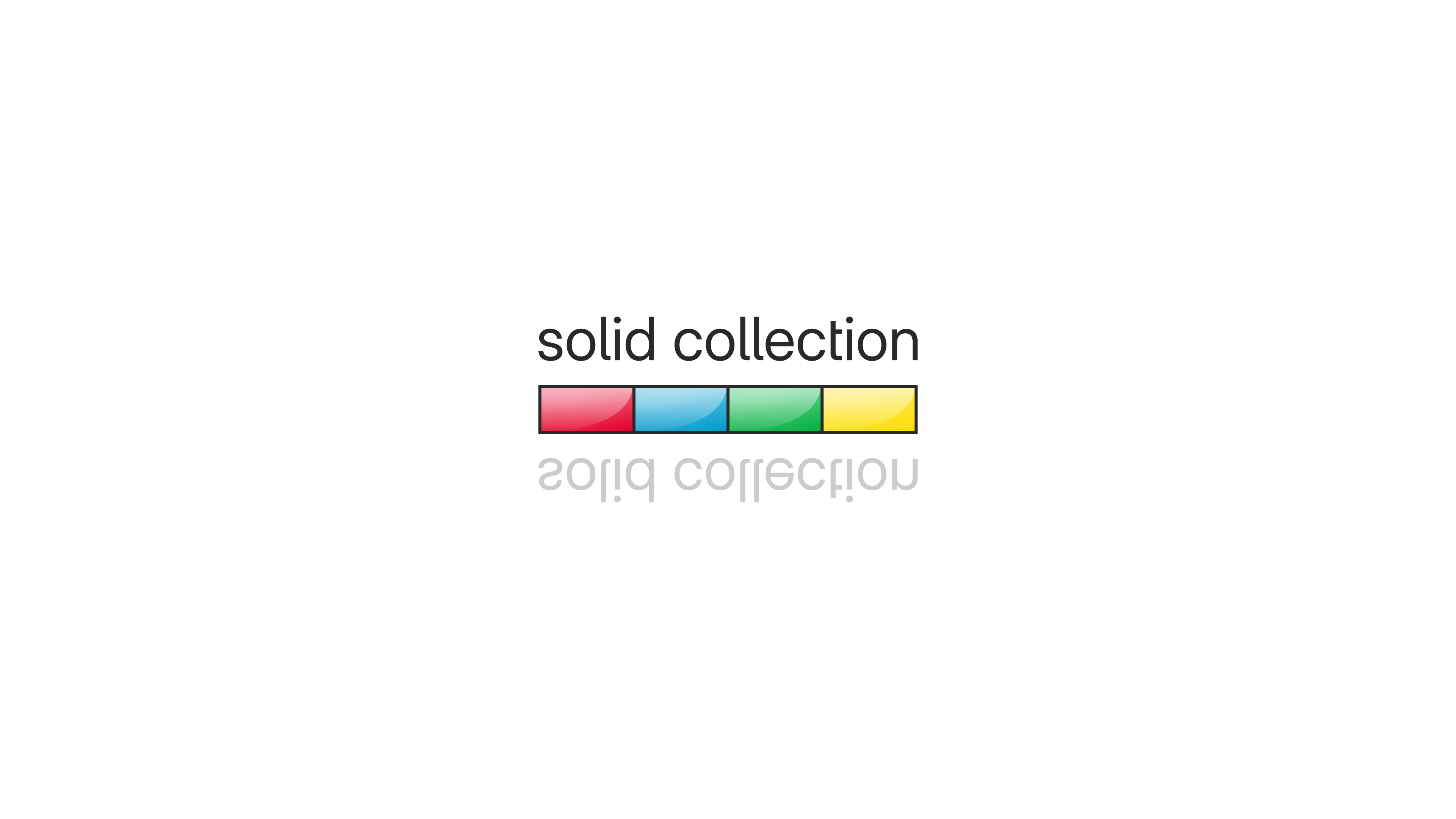
"Solid Collection" Brand Identity
Beginning.
Mesoki didn’t start as a stationery brand. Initially, I imagined it as a line of magnetic iPhone accessories with playful colors and subtle geometry. The accessories were promising, but something about the tactility of paper—its quietness—kept pulling me in.
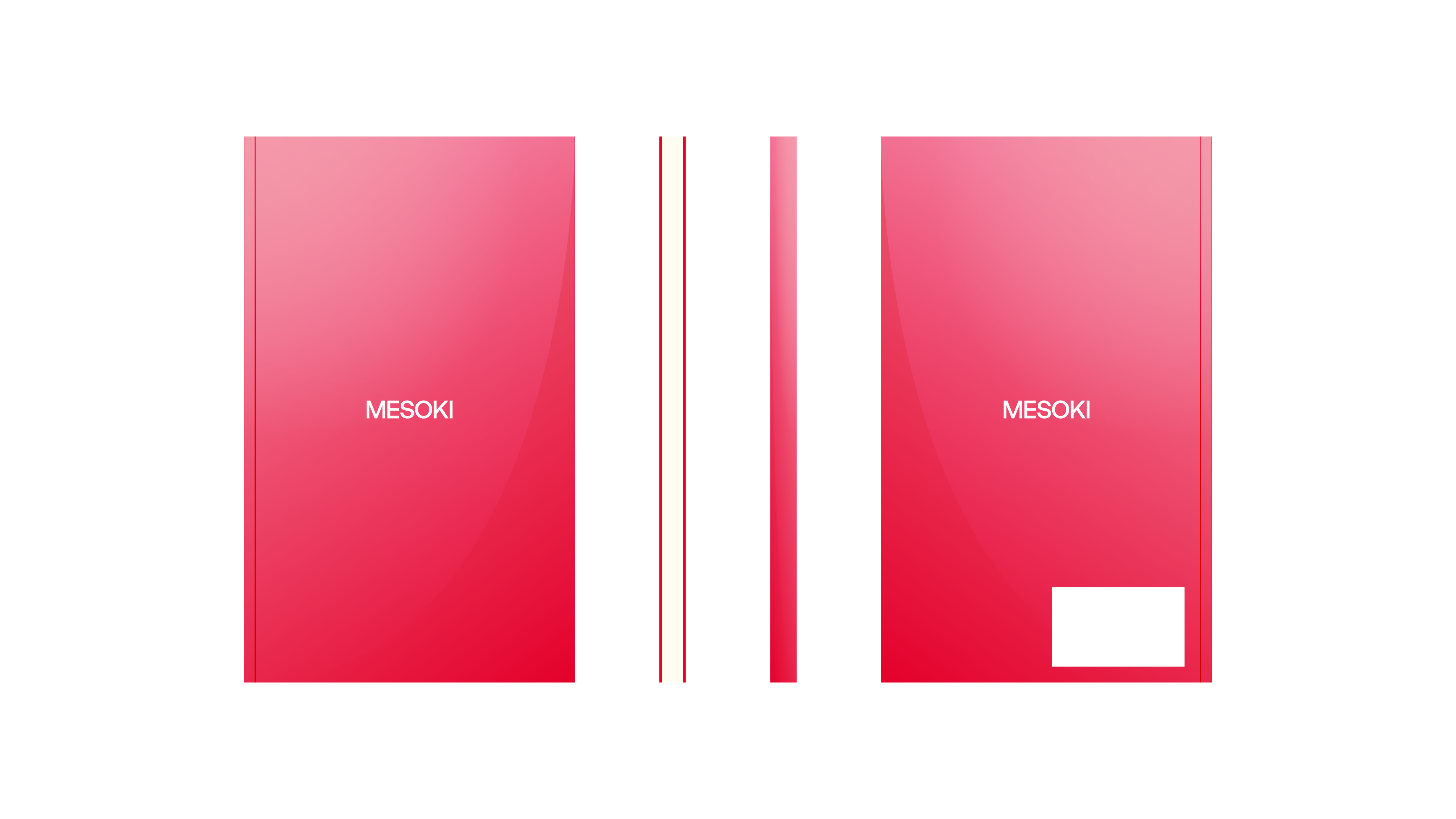
Red Mesoki notebook front and back
Research and Observation.
To understand what made a notebook feel “right,” I collected dozens—Japanese, European, academic, creative. I documented their structure, materials, page balance, weight, binding types. It wasn’t research in the formal sense, but more like observation with purpose. I looked for moments when form supported clarity.
Mesoki logo reveal
Problem.
I began noticing how cluttered most notebooks felt. I wanted to build something that wouldn’t interrupt thought but instead gently hold it. So I paused the accessories path and redirected the brand toward notebooks.

Yellow Mesoki notebook front and back
Design and Interaction.
I set a constraint early: the front cover should have only one word. I also decided each notebook would live in a color—flat, vibrant, self-contained. The identity had to speak in simplicity, and color became the language.
Mesoki morse satisfaction
Takeaway.
Mesoki taught me how to listen—to color, to weight, to white space. It made me more patient. Less obsessed with cleverness. More focused on rhythm, balance, and staying out of the way when it’s not your turn to speak.
More in Projects.
Car Digital Cockpit.
Jan 25.
Developed intuitive digital cockpits integrating real-time data visualization, driver-centric design, and responsive interfaces.
Car Control Widgets.
Oct 24.
Crafted native-style widgets for car controls, bringing Apple’s clarity and consistency into everyday driving.
Noque.
Mar 24.
Engineered an innovative mobile app simplifying restaurant interactions through streamlined ordering and efficient pickup.
Musyka.
Nov 24.
Designed a vibrant digital music experience tailored specifically to the dynamic preferences of new generation.
Kodomi.
Dec 24.
Built a versatile no-code tool empowering designers to rapidly prototype and share UI components and full websites.
More in Nuggets.
FUI.
Dec 25.
An exploration of interface aesthetics where clarity, composition, and signal hierarchy take priority over practical constraints.
Component Shortcut.
Sep 25.
Added a custom shortcut feature for design components to reduce friction and avoid digging through the library every time.
More in Readings.
Word Choice Is Design.
Mar 26.
A reflection on how Apple Maps uses voice intonation to manage your emotional state while driving, and why Google Maps and Waze don't.
Pebble 2 Duo.
Nov 25.
A reflection on finally owning the Pebble 2 Duo, a tiny comeback story about detail, nostalgia, and honest design.
Hello, World!
Sep 25.
A short manifesto for what Readings is, how I use it, and how to read it.
Copyright Maksim Anisimov.
Mesoki.
Nov 23.
Mesoki is a carefully crafted minimalist brand that combines tactile stationery with immersive digital experiences, creating harmony between form and function.
How I Developed Mesoki, a Minimalist Brand Bridging Physical and Digital.
Established a minimalist stationery brand that seamlessly blends functional design and engaging digital storytelling.
"Solid Collection" Brand Identity
Beginning.
Mesoki didn’t start as a stationery brand. Initially, I imagined it as a line of magnetic iPhone accessories with playful colors and subtle geometry. The accessories were promising, but something about the tactility of paper—its quietness—kept pulling me in.
Red Mesoki notebook front and back
Research and Observation.
To understand what made a notebook feel “right,” I collected dozens—Japanese, European, academic, creative. I documented their structure, materials, page balance, weight, binding types. It wasn’t research in the formal sense, but more like observation with purpose. I looked for moments when form supported clarity.
Mesoki logo reveal
Problem.
I began noticing how cluttered most notebooks felt. I wanted to build something that wouldn’t interrupt thought but instead gently hold it. So I paused the accessories path and redirected the brand toward notebooks.
Yellow Mesoki notebook front and back
Design and Interaction.
I set a constraint early: the front cover should have only one word. I also decided each notebook would live in a color—flat, vibrant, self-contained. The identity had to speak in simplicity, and color became the language.
Mesoki morse satisfaction
Takeaway.
Mesoki taught me how to listen—to color, to weight, to white space. It made me more patient. Less obsessed with cleverness. More focused on rhythm, balance, and staying out of the way when it’s not your turn to speak.
More in Projects.
Car Digital Cockpit.
Jan 25.
Developed intuitive digital cockpits integrating real-time data visualization, driver-centric design, and responsive interfaces.
Car Control Widgets.
Oct 24.
Crafted native-style widgets for car controls, bringing Apple’s clarity and consistency into everyday driving.
Noque.
Mar 24.
Engineered an innovative mobile app simplifying restaurant interactions through streamlined ordering and efficient pickup.
Musyka.
Nov 24.
Designed a vibrant digital music experience tailored specifically to the dynamic preferences of new generation.
Kodomi.
Dec 24.
Built a versatile no-code tool empowering designers to rapidly prototype and share UI components and full websites.
More in Nuggets.
FUI.
Dec 25.
An exploration of interface aesthetics where clarity, composition, and signal hierarchy take priority over practical constraints.
Component Shortcut.
Sep 25.
Added a custom shortcut feature for design components to reduce friction and avoid digging through the library every time.
More in Readings.
Word Choice Is Design.
Mar 26.
A reflection on how Apple Maps uses voice intonation to manage your emotional state while driving, and why Google Maps and Waze don't.
Pebble 2 Duo.
Nov 25.
A reflection on finally owning the Pebble 2 Duo, a tiny comeback story about detail, nostalgia, and honest design.
Hello, World!
Sep 25.
A short manifesto for what Readings is, how I use it, and how to read it.
Copyright Maksim Anisimov.